I am not an artist, and I won't pretend to be. I think I may have failed finger painting. But I do have a good eye, and I notice small details.
When AI image tools first came out, what caught my attention was how good one picture could look while the next one was complete junk. I design word games for a living. I also have fond memories of playing Dungeons & Dragons with my nerdy friends. With AI, I felt I could put the two together. The result is Epic Words.
Epic Words is fairly new, and a lot of the early reviews called the art "AI slop". I was shocked at first. Then I reminded myself that everyone is entitled to an opinion, and I started to wonder about the label. When does a picture made with AI stop being "AI"? Does it have to reach the standard of a Hollywood blockbuster? Or is any picture that came out of an AI tool slop, no matter what? Most films today are full of computer graphics, but people drive that work by hand, so nobody calls it generative AI.
So yes, I used AI for the art in Epic Words. It was not easy and it was not quick. I am writing this to show what it took. Getting the look you want from these tools takes a lot of time and a lot of looking. If the traps I fell into help you avoid them in your own project, this article has done its job.
The job
I needed a deck of 52 characters. They are roaming tradespeople: a baker, a blacksmith, a weaver, a falconer and 48 more. Each has a name and a short description, and each needed a portrait. All 52 had to look like the same painter made them, so they read as one set. I also needed 16 named characters for a second deck.
My plan was simple. Write one good set of instructions, drop each character's description into the middle, and run it 52 times.
That is not how it went. I fixed six problems in a row, and five of those fixes caused the next problem. Three full attempts failed and I threw away about 43 pictures before I had a way of working that held up.
Here is the whole chain, in order, with the real pictures.
Problem one: 52 people from the same family
The first thing a character set needs is one style. Same painter, same light, same world. The obvious way to get that is to give the AI a finished portrait you like and ask for more like it.
So I did that. This came back.
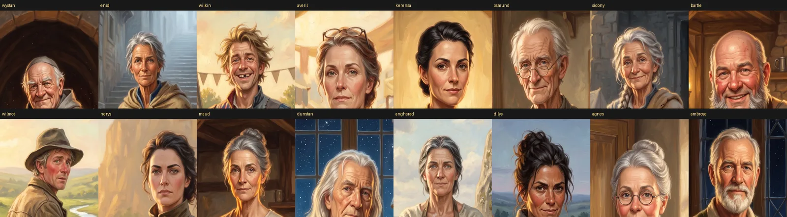
Look at the women. Averil, Kerensa, Nerys, Angharad, Dilys. Same oval face, same dark arched brows, same nose, same eyes. They are one woman in different clothes. The old men are one white-bearded man painted four times.
I blamed the wrong thing first. These tools start each picture from a random number, and I thought I was getting the same number every time. Change the number and you change the person. That was not the cause.
The cause was the kind of tool I had used. I gave my sample portrait to an "edit" tool. An edit tool is built to keep what is in the picture you hand it. I thought I was handing over a style. The tool saw a face, and it kept that face 52 times.
If your characters all look related, check this before anything else.
Problem two: the AI signed its paintings
While I was sorting out the faces, a second problem turned up that had nothing to do with them. The AI kept painting an artist's signature into the bottom right corner. Sometimes it was two initials. Sometimes it was a small scrawl in joined-up writing.
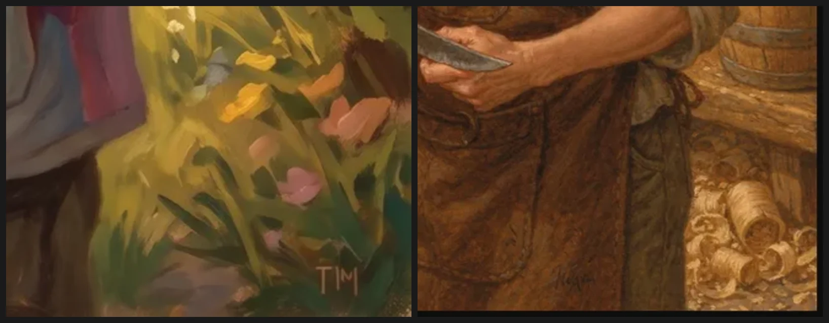
It did not happen every time, and that is what makes it hard to catch. Three or four pictures in a row can come back clean.
The reason is simple once you see it. The AI learned to paint by looking at paintings, and most finished oil paintings are signed. To the AI, a signature is part of what a finished painting looks like.
I stopped trusting my eye and counted. One AI model put initials on about 94 of every 100 portraits. Another painted a fake signature on about 40 of every 100. My rule now is to check at least fifteen pictures before I believe a model leaves the corners alone. Three clean pictures tell you nothing.
Problem three: the cure was worse
This is the first place a fix caused the next problem.
To get away from the signatures, I switched to a different AI model. It learned from different pictures, so I hoped it had no habit of signing.
The new model gave me different faces, which fixed problem one for free. But the painting was much worse, and you could see it at a glance. I threw the whole attempt away.
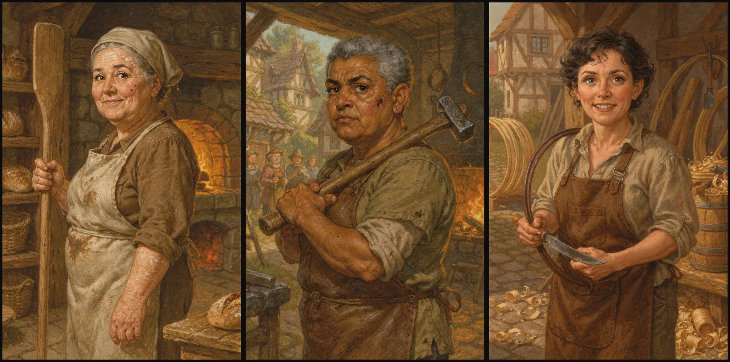
Three different people, so the family problem was gone. Now look at the surfaces. They are flat and muddy next to the warm oil paint I had already picked. In a deck beside the others, these would look like the work of a different artist.
It also still signed about 40 of every 100. The scrawl on the right of the close-up above is from the cooper in this batch.
I had swapped a good painter with an annoying habit for a worse painter with the same habit. I wrote a rule down after this: do not change your AI model to fix a problem with your instructions. A signature in the corner means you write a better instruction and then check the corners. When you change models, you have to settle style, colour, light and brushwork all over again, and the small problem is still there.
Problem four: describe a type and you get the average
I went back to the good painter. I took the sample portrait away and described each face in words.
The paint was good again. The people still repeated. They were no longer identical, but they all came from a small pool of faces, and they were the AI's faces, not mine.
This was the hardest problem to spot, so I will say it plainly. If you describe a kind of person, the AI gives you the most common version of that kind of person.
"A weathered blacksmith in his forties" is a kind of person. The AI answers with the middle of every picture it has seen with those words on it. Write 52 of those and they still land on a handful of faces, because the middle of one kind sits close to the middle of the next.
My descriptions were all different. They were not detailed enough to get away from the average.
Problem five: pushing them apart made cartoons
The fix is to give each character something the average does not have. "Weathered" is no help. It has to be one named feature on one side of the face that you cannot miss. A nose broken and set badly to the left. A split nostril healed into a notch. One corner of the mouth pulled down.
This works. It is the most useful change I made. It also caused two new problems straight away.
The first problem was that a short list of features is another kind of sameness. I asked for "a distinctive mark" and let the AI pick. It picked from a very short list. In one batch nearly everybody had a mole. I fixed that, and in the next batch nearly everybody had a scar across the mouth, in the same place and at about the same angle. It looked as if the whole guild had been in one bar fight.
That is problem four again. "A distinctive mark" is a kind of thing, so the AI gave me the most common version of it. The mark has to be named for each person, and the list has to be long. The set that worked uses nineteen kinds of feature. Across forty characters, "scar" comes up six times and "mole" once. That spread only happened because I wrote it down.
The second problem was worse. My grocer is a small, neat, fussy man who sells vegetables and disapproves of you. This came back.
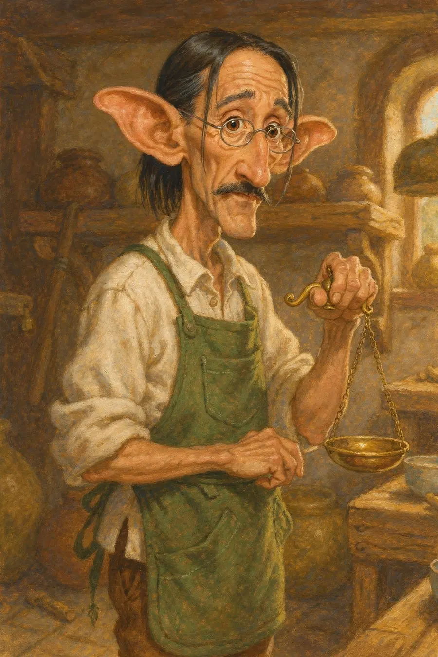
That is an elf. His written description is an ordinary 51-year-old man with a waxed moustache. It does not mention his ears.
I would like to show you the instructions that made him. I can't. I was not yet saving the instructions next to each picture, so they are gone.
I can show you the kind of wording that does this, because it is still in another character. My town crier's description asks for "large ears standing well out". Those are plain words. But "large" tells the AI which way to go and gives it no place to stop. His description also has an "unusually large head", a jaw "like a shovel" and a mouth that "opens enormously". He is drawn from a low angle in the middle of a shout. Each of those is fine alone. Stacked up, they walk away from a person and toward an ogre.
The AI does not know where the human range ends. It knows which way "larger" points and it keeps going.
The same thing gave me a juggler with a red ball of a nose and ears like jug handles.
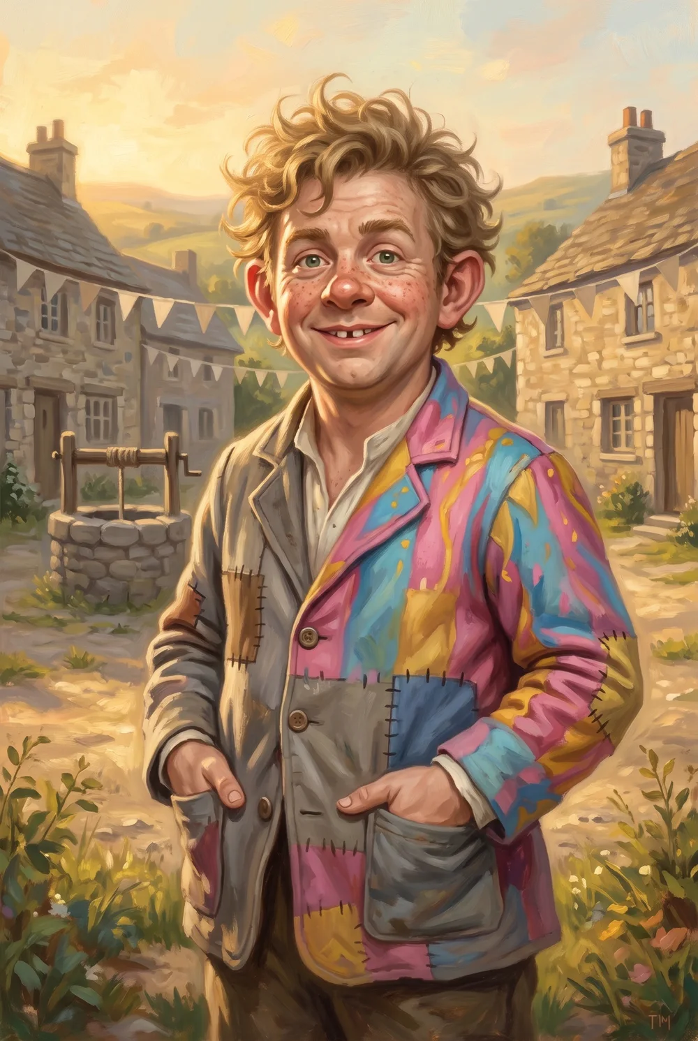
He is a cartoon of a village fool. Put him in a deck beside 51 painted portraits and he looks like he came from a different game. He is also the portrait with the painted initials in the corner that you saw earlier.
Here is one more thing about the grocer. I made two pictures of him at the same time, with the same model. The other one has a rust-red signature on the shop wall behind him. The elf above is clean. Same character, same model, same run, and one of the two was signed.
What I took from the elf is that a feature needs a limit as well as a direction. "Large ears standing out from the head" invites the AI to keep going. "Ears that stand out enough to notice, in normal human proportion" does not. If a feature does need to be extreme, give it a cause. An ear notched by an old injury has a natural limit. An adjective does not.
Here is the whole batch from that attempt.
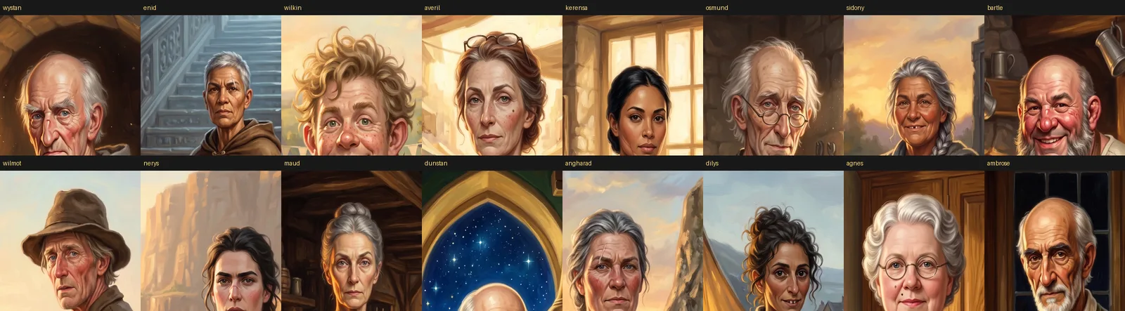
The faces are fixed. Compare it with the first grid and the progress is real. But two have gone cartoonish, one has the head sliding out of the frame, and one character came back looking like he belonged to a different part of the world from the one I had written.
The setting problem
One character did not match the world I had asked for. It is easy to think the AI got the geography wrong. That is not quite what happened.
The AI does not hold a setting in its head. It holds an average. Write "medieval merchant" and stop there, and you get the middle of a hundred years of book covers, films and other people's fantasy art. Sometimes that matches your world and sometimes it does not.
The fix is to write down where each character comes from, as a choice you made. I did not expect what came next. Doing that gave me a wider range of people than leaving it to chance ever had. The finished set has thirty stated origins, among them Norwegian, Levantine, Yoruba, Sinti Roma, Amazigh, Kazakh, Basque, Igbo, Sicilian and Somali. A trading world full of roaming tradespeople should look like that. Left to the average, the deck would have been much narrower.
Problem six: the finger fix chose the pose
I would never have guessed this one, and you cannot see it in a single picture.
Hands are the famous AI art problem. Six fingers, fused fingers, a thumb in the wrong place. So my instructions had a line to protect the hands. It said, roughly: both hands held well apart from each other and clear of the clothing.
That sounds sensible. Hands that are apart and in the open are less likely to melt into each other or into a sleeve.
Then I made sixteen finished cards and looked at them together.
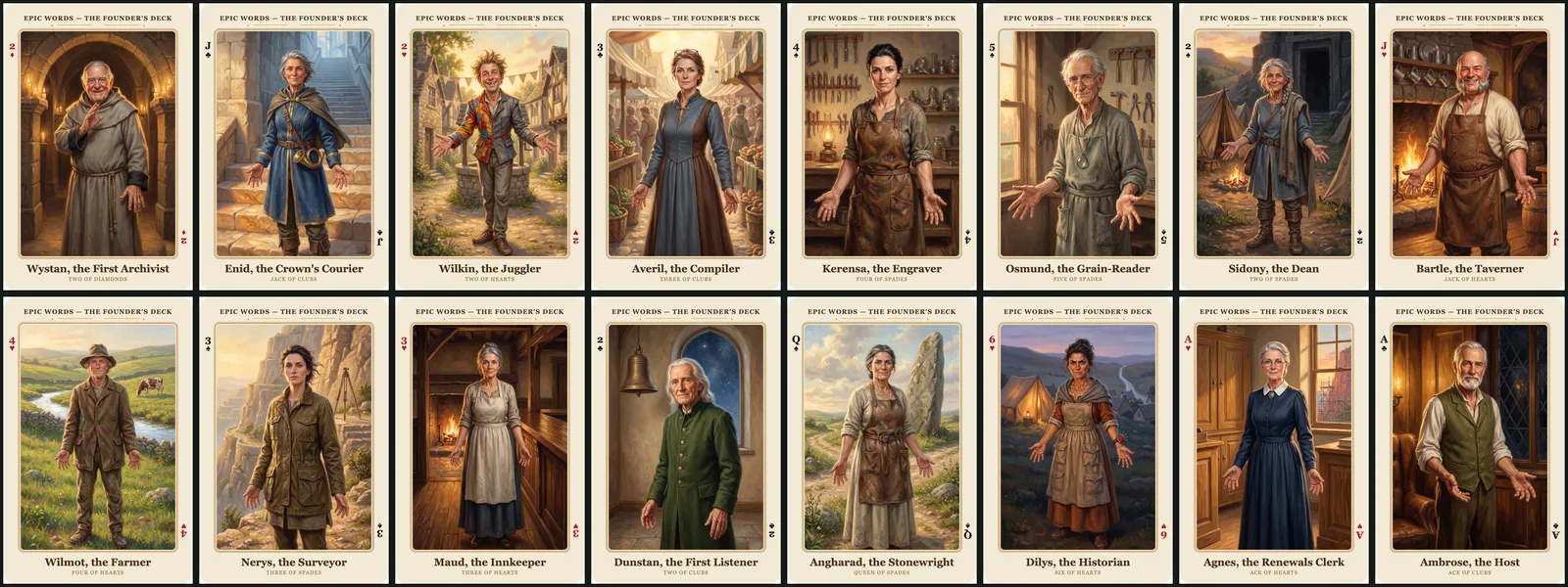
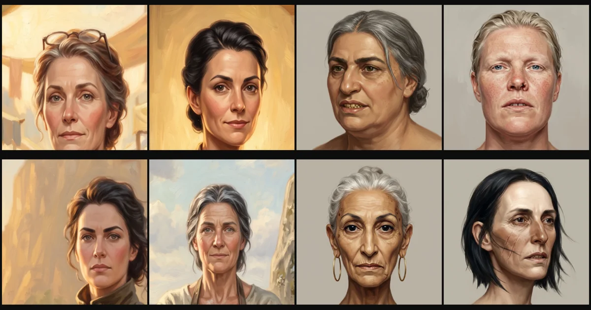
Every one of them is doing the same thing with their arms.
There is only one way to hold both hands well apart and clear of your clothes. You put your arms out with your palms open. I thought I had written a safety rule. I had written a pose, and the AI followed it exactly. Seven of the sixteen came back in the same welcome and the rest were close.
The real cause of finger trouble is much narrower. It is gripping an object with moving parts. Hands that are clasped, folded, in pockets or flat on a table are safe, and none of those force a stance.
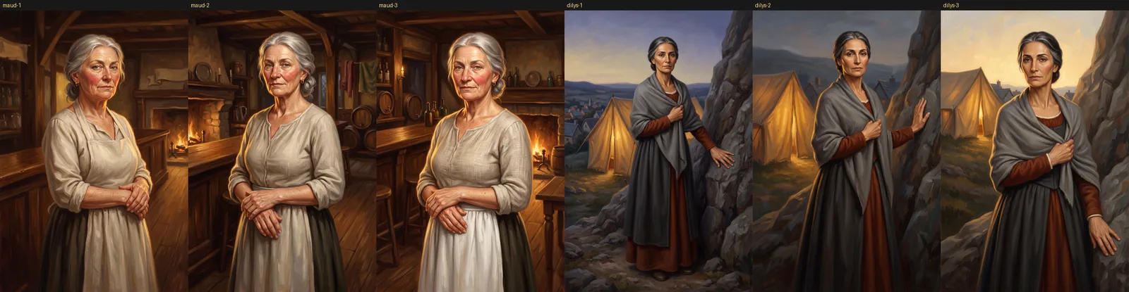
The hands are just as safe, and nobody is standing in a chorus line.
What fixed it
The way of working that held up has four parts. None of them is clever.
It runs in two steps. First I make a cheap square picture of the head and shoulders on a plain background, where the only thing I am judging is the face. When I approve a head, I make the full portrait and give the AI that approved head to copy. The face copying that ruined my first attempt is what keeps the face the same here. It was a disaster in one spot and it does the most important job in the other.
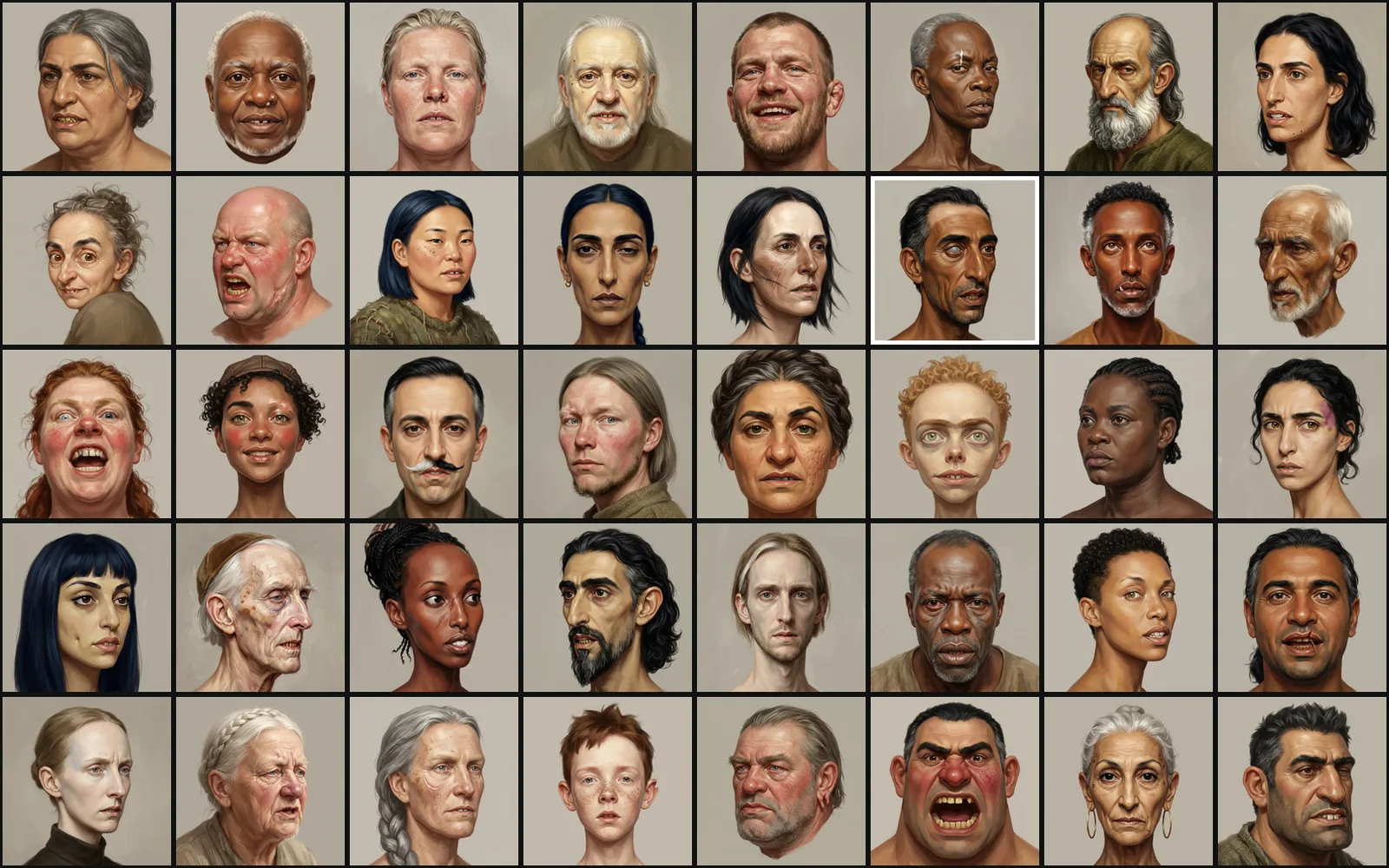
These are the head studies. They are not all good. One has a white border that should not be there. One has eyes too big for a human head. One is the shouting town crier from problem five. The first two were made again before a full portrait was painted from them. The town crier was not, and he is in the game looking much like that.
Every character is written down in full before anything is made. Ancestry, age, build, a specific face, one named feature on one side, the camera angle and the expression. It is a person, not a kind of person. Each one runs to about 700 to 900 characters of text. The only words any two of them share are the opening lines about the painting style.
Rules are written as things the picture has. The tool I use has no box for "things I don't want", so I cannot type "six fingers, extra limbs" and call it done. I write "all four corners are clean painted material" where I used to write "no watermark". I would keep doing this even with a tool that had the box.
The instructions are saved next to every picture. This is the dullest part and it is the reason I could write this article. I can open any face and read what made it. I did not do this at the start, which is why the worst instructions are gone and I had to describe them from memory.
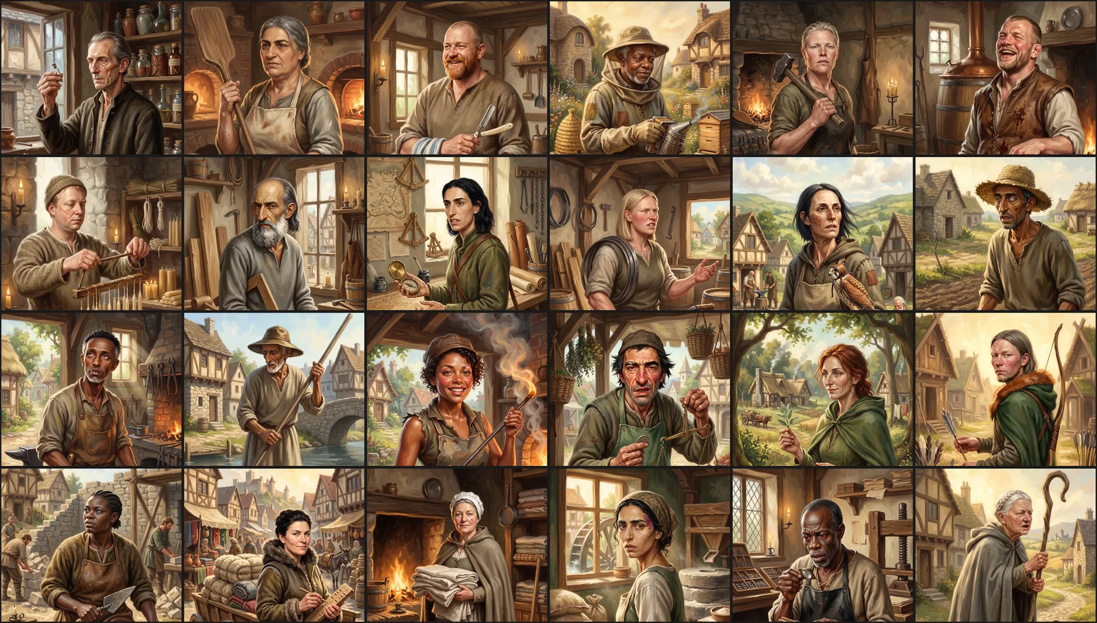
Here are some of the portraits as they appear in the game.
What I learned
You cannot see these problems one picture at a time. The family faces, the batch of moles, the matching pose and the initials in the corner all look fine in a single picture. You only see a repeated face when it sits next to the other one. Checking pictures one by one as they arrive will pass all of it.
So my checking now ends with grids. One grid has every picture. One has only the faces, cropped close, and that catches the family problem. One has only the bottom right corner of every picture, and that catches signatures. The corner grid takes a few seconds to scan, and it found things I had already approved.
Fixes come in chains. The sample portrait caused the family faces. Running from signatures cost me the good painter. Pushing faces apart caused the cartoons. The hand rule caused the pose. When you change one thing, go and look at what else moved.
A version number is not a quality score. Two of the models I could use were called, by name, version "2" and version "pro". The one with the higher number is the cheaper, faster one. I had two AI helpers working on this, both told to "use the latest model", and they read that two ways. One picked the newer sounding number and got the worse painter. That is a fair reading of what I said. I wrote an unclear instruction.
The lesson was already written down. I keep a list of image traps from earlier projects. One line in it says to change the sample portrait for every card in a set, because a fixed one leaks one face into every card.
That is problem one. I wrote that line, and I walked into it anyway. Knowing about a trap and checking that you have not fallen into it are two different jobs.
I have done this before. While fact checking the post about how Pairdle got built, I found that the board generator had been throwing away seven of every eight words for six months. A comment in the code said it did the opposite. It could have been measured the whole time, and nobody measured it.
It happened again while I was writing this. I was reading this article back, looked at the pictures, and saw a white mark on one woman's forehead. I checked the game. She is the butcher, and she shipped like that.
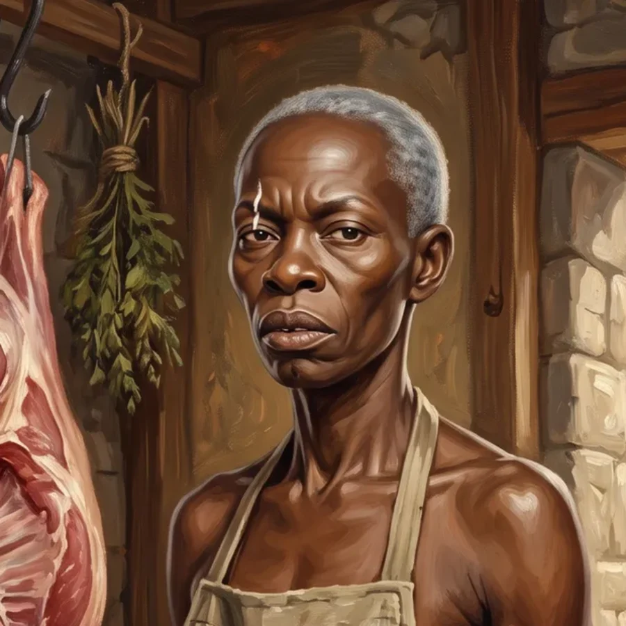
The tools are very good. The best of these portraits are better than anything I could pay for on a small studio's budget. But the job of directing the art did not go away. It used to be drawing. Now it is writing down exactly what you want and then looking hard at what comes back. The looking is the part that is easy to skip.
If you want to see where these ended up, they are the tradespeople in Epic Words. If you would rather read about a puzzle, Pairdle is the game that started all of this.
Related articles
Pairdle 1.5: What's New, What's the Same, and an Exciting New Level
Pairdle 1.5 puts every level on one row, unlocks Pro, adds Expert and endless Practice, and introduces Olly the owl. Plus what a 12-tile board really holds.
How I Came to Build Pairdle and Accidentally Made It EPIC
I loved Wordle but refused to clone it, so I built a puzzle out of letter pairs instead. Then, fact-checking this very article, I found the generator had been throwing away seven of every eight words since December.
Fluffy Drop: A Gentle, Modern Take on an Old Favourite
A maze-like board, brightly coloured fluffy characters and numbered spaces to fill. A casual puzzler gentle enough to play while winding down for bed.